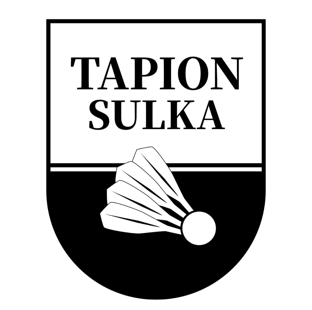
- When one of Finland’s largest and most successful badminton clubs refreshes its brand identity, it takes a big team of volunteers to make it happen. The work has been guided by the club’s core values — community, courage, and human‑centredness — and the result will hopefully make these visible to both current and future members, emphasizes Tapion Sulka’s Executive Director Tarja Arkio.
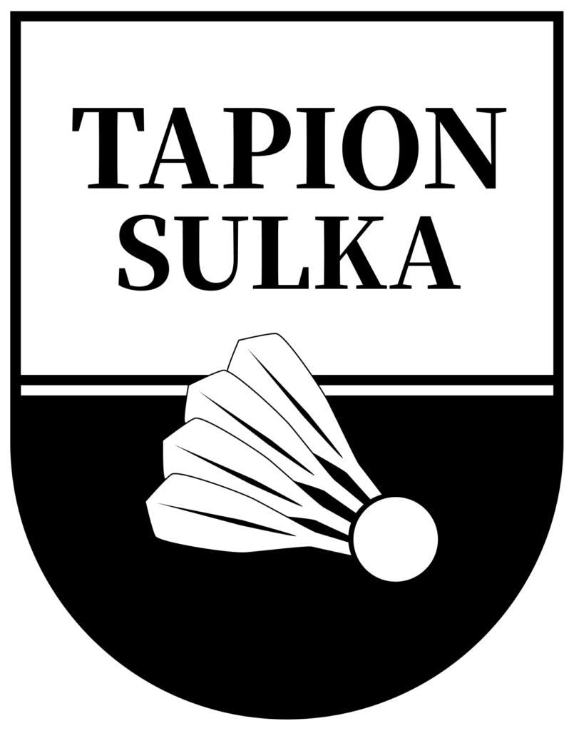
In renewing the brand identity, special attention was paid to the fact that of the club’s more than 700 members, about 450 are under 18 years old. The club’s communications committee took on a major and responsible role in the process, and the bold first drafts by social‑media communicators Lumia Schmidt and Sara Sundelin gave the project a dynamic start. Various stages of the process involved both the club’s board and external design and consulting support. The club’s summer employee Alicia Gras was responsible for updating the club’s materials.
Tapion Sulka’s original, freehand‑drawn feather has been simplified and complemented with several feathers — symbolizing the club’s sense of community and human‑centred approach. The traditional, also hand‑drawn club name has been modernized with a slightly lighter font and given space around it — room to act boldly, in line with the club’s values.
The new logo and brand identity were unveiled at the club’s 66th anniversary celebration on August 25. The club is updating its website, social‑media accounts, and the look of the Esport hall to match the new brand. At the same time, the club shirt was redesigned in collaboration with its long‑time partner FZ FORZA, now part of Sports Group Denmark. The new club shirts can be ordered from the website at a campaign price until September 15, after which they will be available at the regular price. A hoodie, pants, and competition shirt have also been selected from FZ FORZA’s new collection.
Order here: https://tapionsulka.myclub.fi/flow/events/11444114